LOGO DESIGN | 标志设计
1.Xin Yuan Food | 鑫源食品
2.Rime Socks | 华润韵魅袜业
3.Ideal Electronic | Ideal 电子
4.GD Innovative Design Training School | 广东省创新设计职业培训学校
5.HuaXin Auto Parts | 华鑫汽车配件
6.Dobel Electronic | Dobel电子
7.Hi Young Tecnology | 华源科技
8.Asia Musicians Association | 亚洲音乐家协会
9.Jin Lu Ceramic | 金鹿陶瓷
10.Guangdong Industrial Design Association | 广东工业设计协会
11.Yage Ceramic | 雅各陶瓷
12.Gong-Ga Hostel | 贡嘎驿站
13.Flywing Sport | Flywing运动用品
14.Wanpo Logistics | Wanpo 物流
15.Yogoo Hard ware | Yogoo 工具
16Xiliang Concrete | 喜良水泥
17.JinSheng Ceramic | 金盛陶瓷
18.Yagoal Ceramic | 雅高陶瓷
19Ideal Tech | 新意通讯
20.Fire Bird Basketball Team | 火鸟篮球队
21.Class Logo | 班徽
22.Wing Basketball Team | 展翼篮球队
23.Sketching Course | 手绘课程标识
24.HK Ruiwenlove Charity | 香港瑞文慈善组织
25.Rhino Modeling Course | 建模课程
26.Advance Basketball Team | 进化篮球队
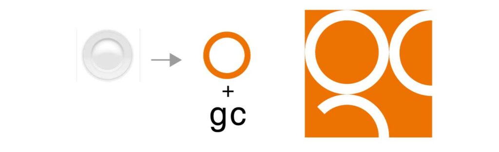
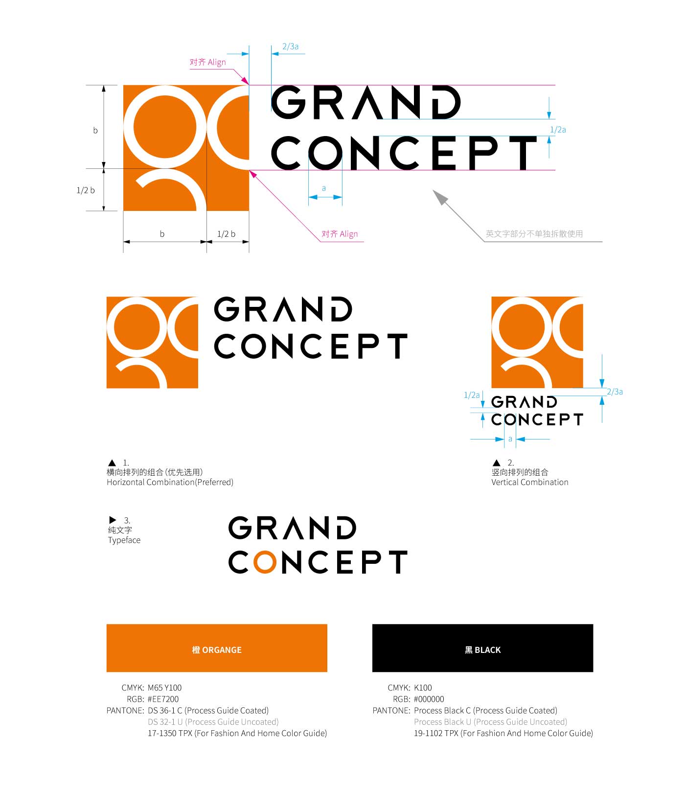
Grand Concept
Grand Concept is a Hong Kong company whose main business is food utensils. We simplified the image of a plate, which is the typical image of food utensils, into circles as the main visual element. And combined the circle element into the letter G and C which are initials of the company name. In addition to conveying health and appetite of food utensils, the orange color chosen for the logo also represents vitality to imply the booming of the company’s development.
Grand Concept以食品用具为主要服务业务的香港公司,因而从食品用具的代表形象 “碟子” 进行提炼, 简化成圈;以圈作为标志的主要元素,组合成g和c——公司名称的首字母,这样的组合充分体现标志的特有性。标志所选用的橙色除了传达食品用具的健康和食欲之意,还代表代表活力,寓意公司的发展蓬勃,充满生机。
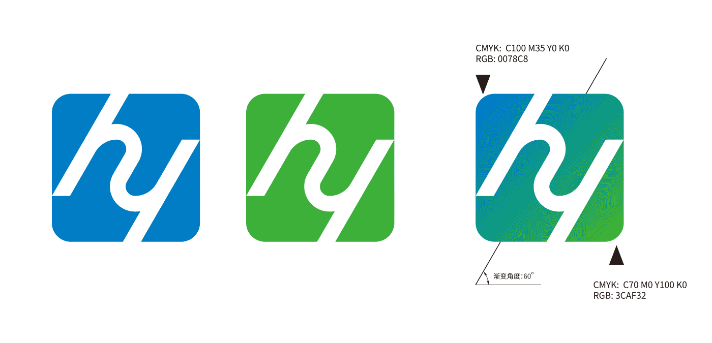
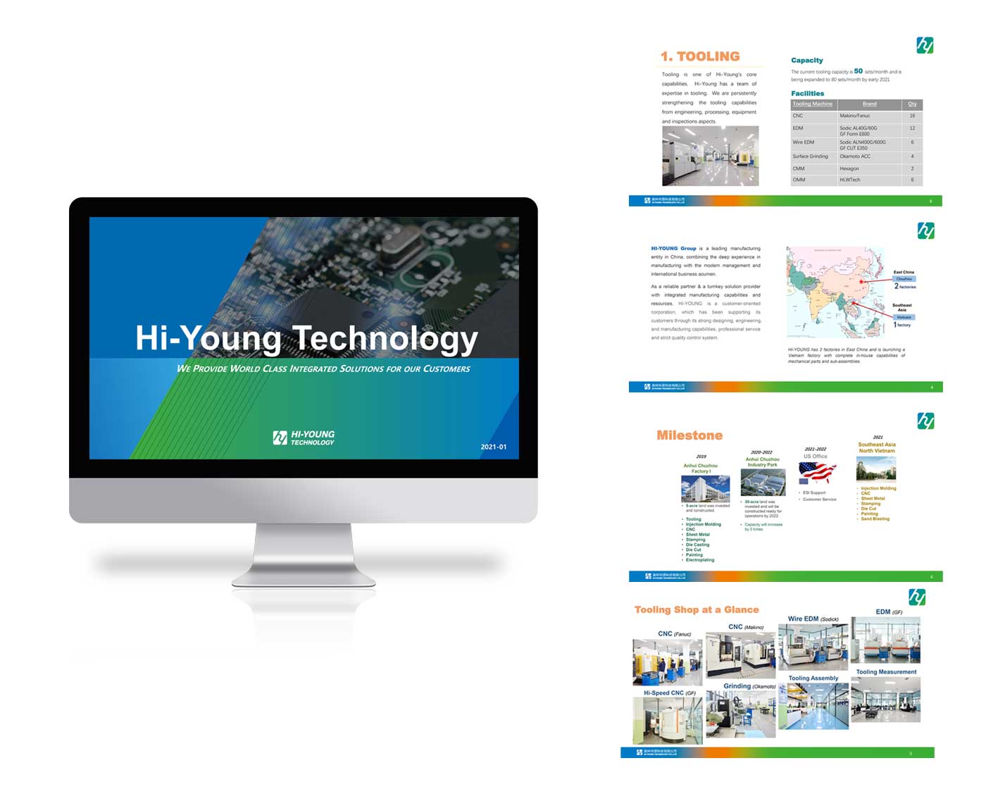
HI YOUNG | 华源集团
HI-YOUNG Group which has her branch in China, south-east Asia and America is a leading manufacturing entity in China, combining the deep experience in manufacturing with the modern management and international business acumen.
华源集团是一家中国领先、在中国、东南亚、美国均有设厂的制造业实体公司,以现代管理和敏锐的跨国商业模式深度整合制造业。
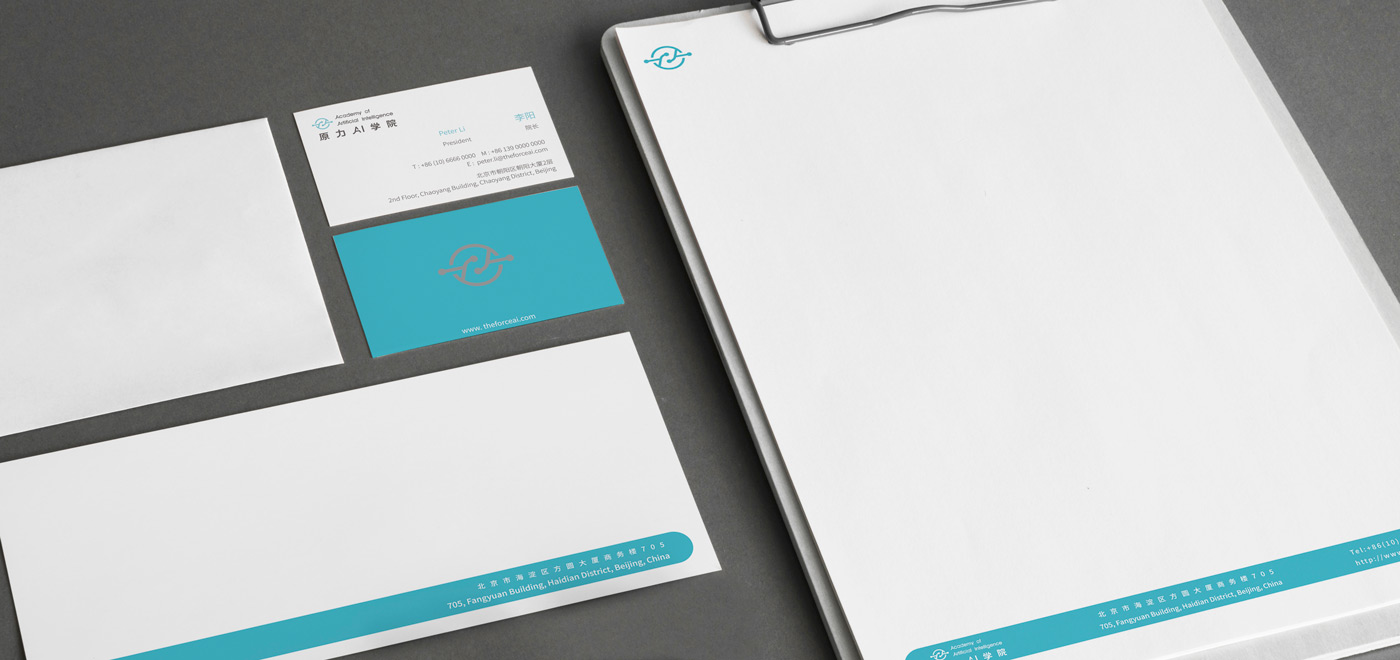
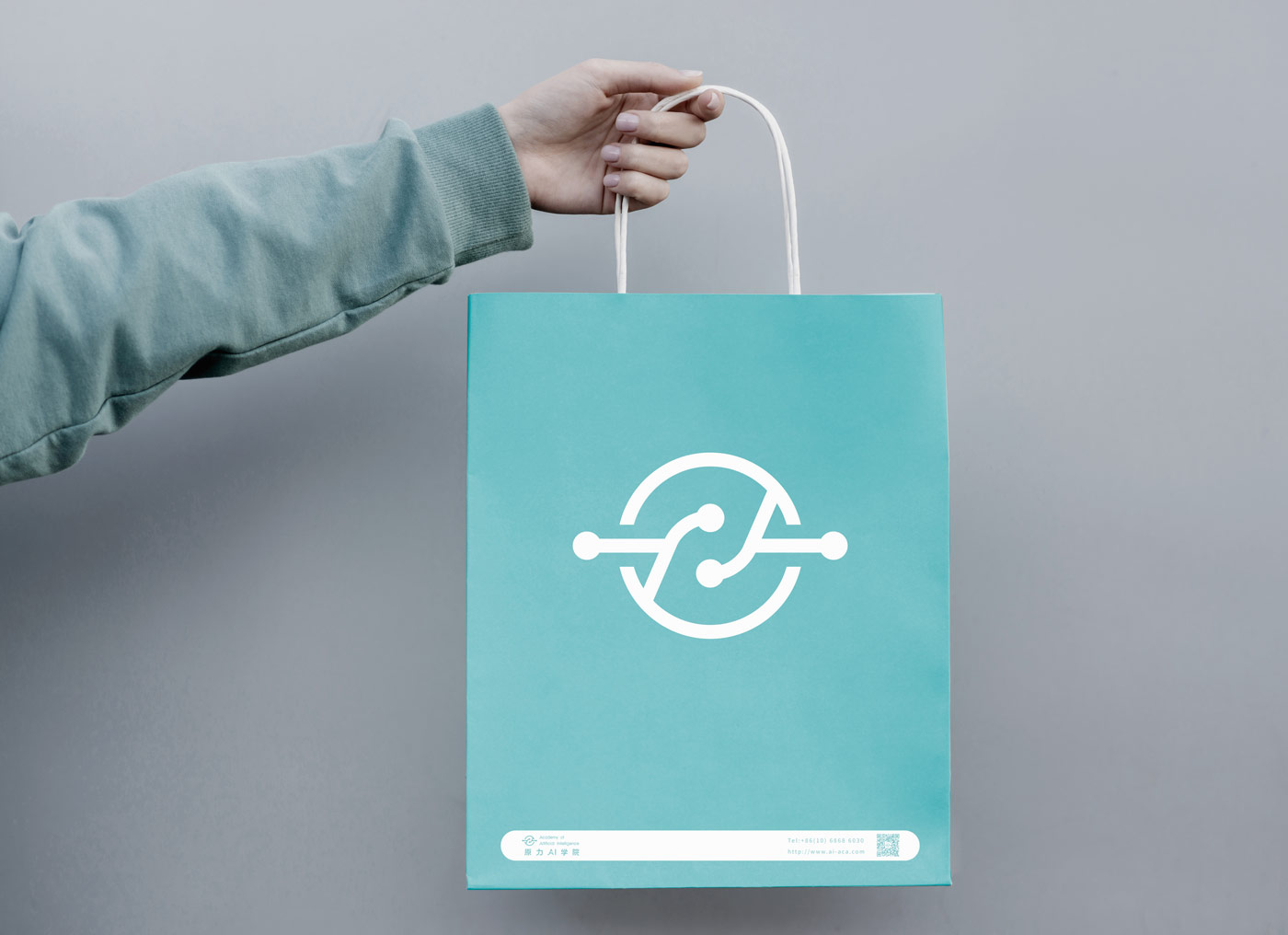
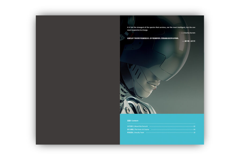
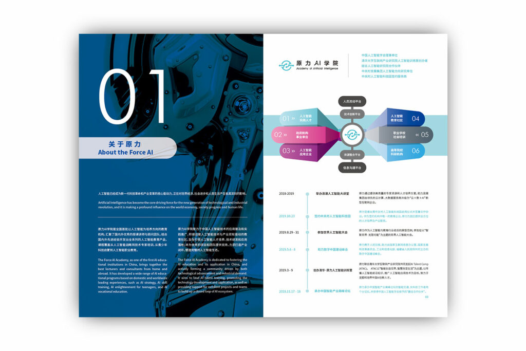
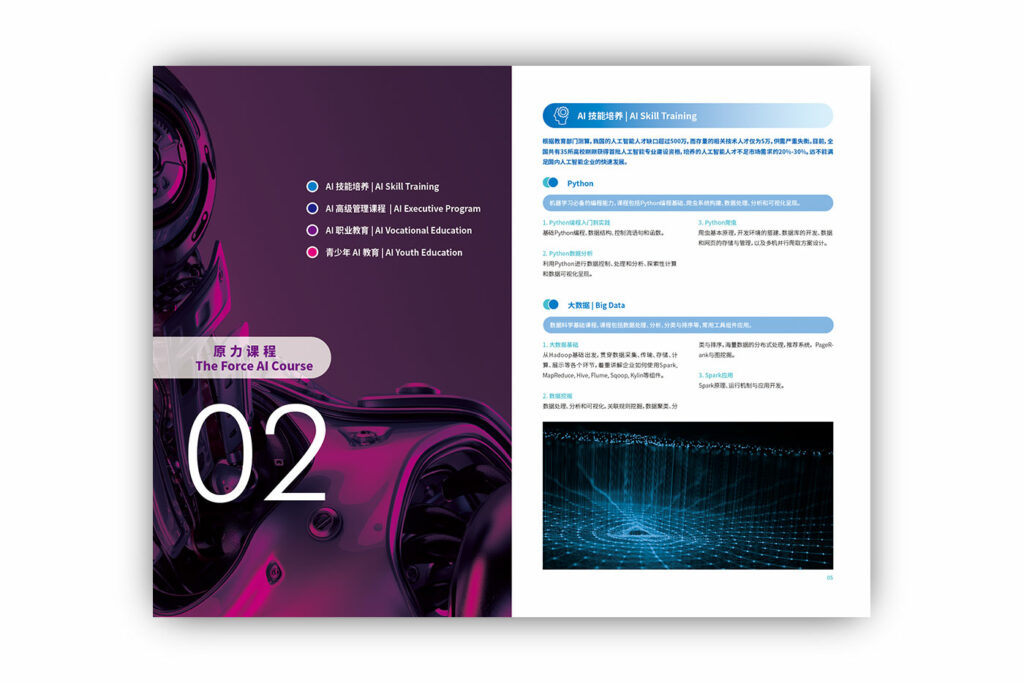
THE FORCE AI ACADEMY | 原力AI学院
The Force AI Academy is a new type of institute dedicated to the study and application of artificial intelligence. She connects schools, corporate and government departments as a bridge in the field of artificial intelligence. Thus, interconnection is an important feature of the Force AI Academy. The name FORCE comes from Star Wars, referring to a mysterious force of natural existence. In order to provide the logo a deeper meaning, we introduce the Chinese “tai chi” image.
原力AI学院是一个致力人工智能学习和应用的新型学院,她关联着人工智能领域的学校、企业和政府部门,促进各个机构的互动,在该领域中扮演着纽带的角色,所以除了人工智能属性之外,“互联”就是原力AI学院的一个重要的特征。原力(FORCE)这个名字是来自于星球大战,指代一种自然存在的神秘力量;为了让标志带来更深的含义,图形引用了中国“太极”中一生为二,二合为一的形式。

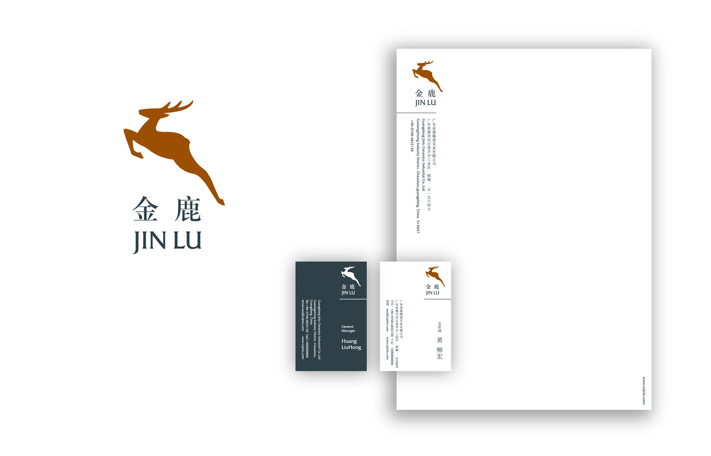
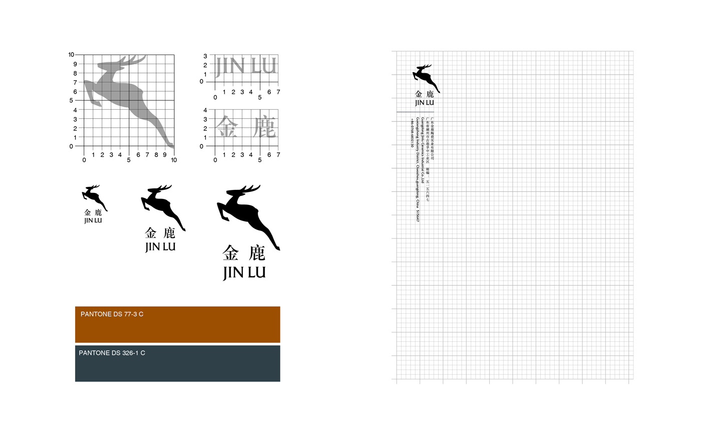
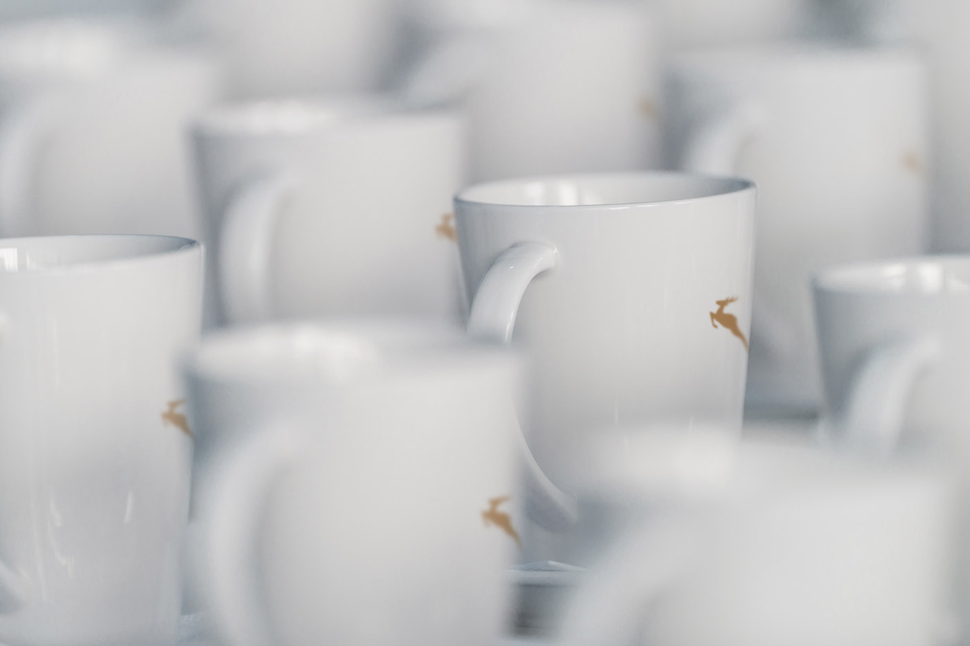
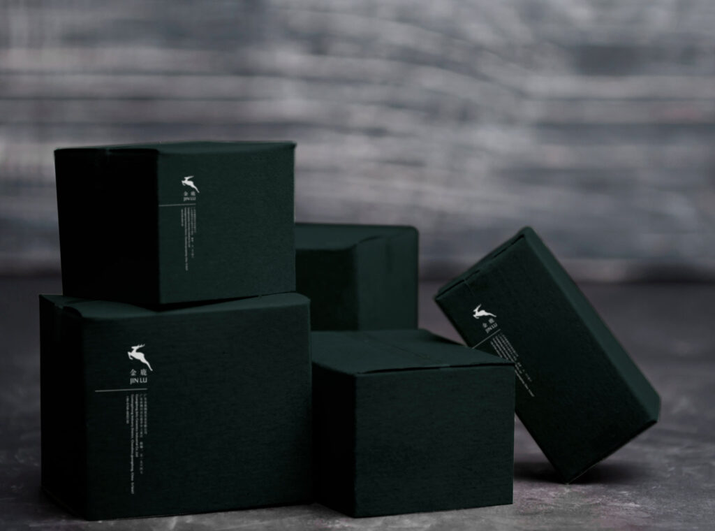
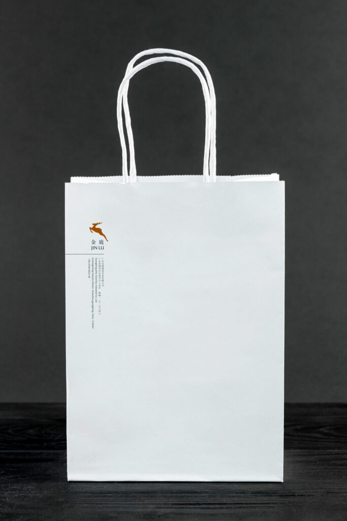
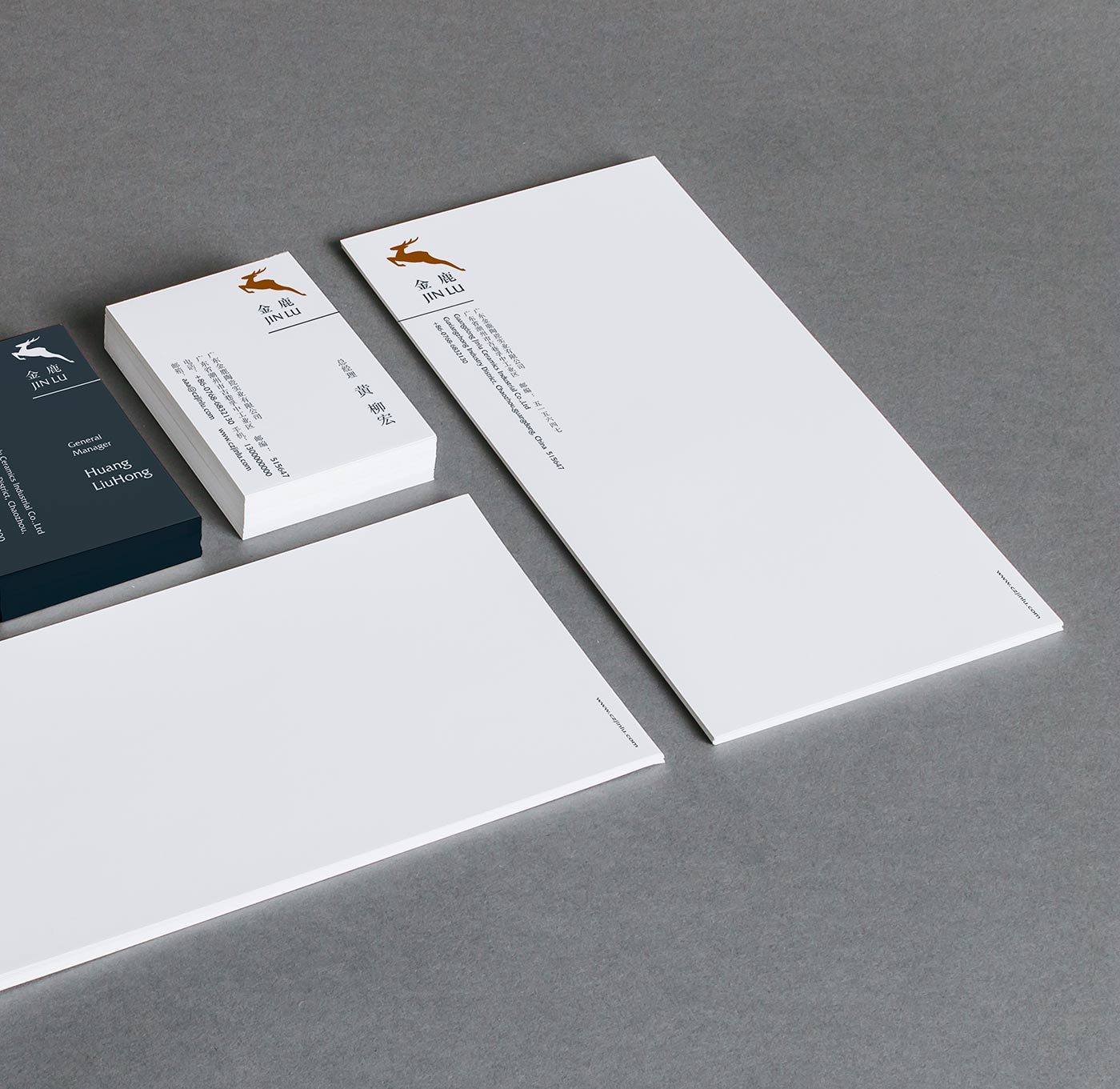
JINLU CERAMICS | 金鹿陶瓷
JINLU is a ceramics company with a history of more than 30 years. Their bone porcelain tableware has a long-standing reputation and has been used by institutions such as the Great Hall of the People and various five-star hotels for a long time. Since the brand JINLU and its old logo have long impressed their customers, when we design the new visual identity system, we decide to maintain the unique feature of the old one, and optimize on the image and characters. In addition, the new color recognition system also matches JINLU’s image as a historical corporate.
金鹿是一家拥有超过30年历史的陶瓷制品企业,他们所制作的骨瓷餐具久负盛名,中国人民大会堂、各五星级酒店等机构都长期使用。虽然旧的标志系统已经无法更好地呈现该企业的形象,但由于其名字和旧标志已经长期给客户留下深刻的印象,所以新的视觉识别系统只是在旧有标志和名字上进行优化;另外,新的颜色识别系统也赋予了金鹿“历史悠久”的企业特征。

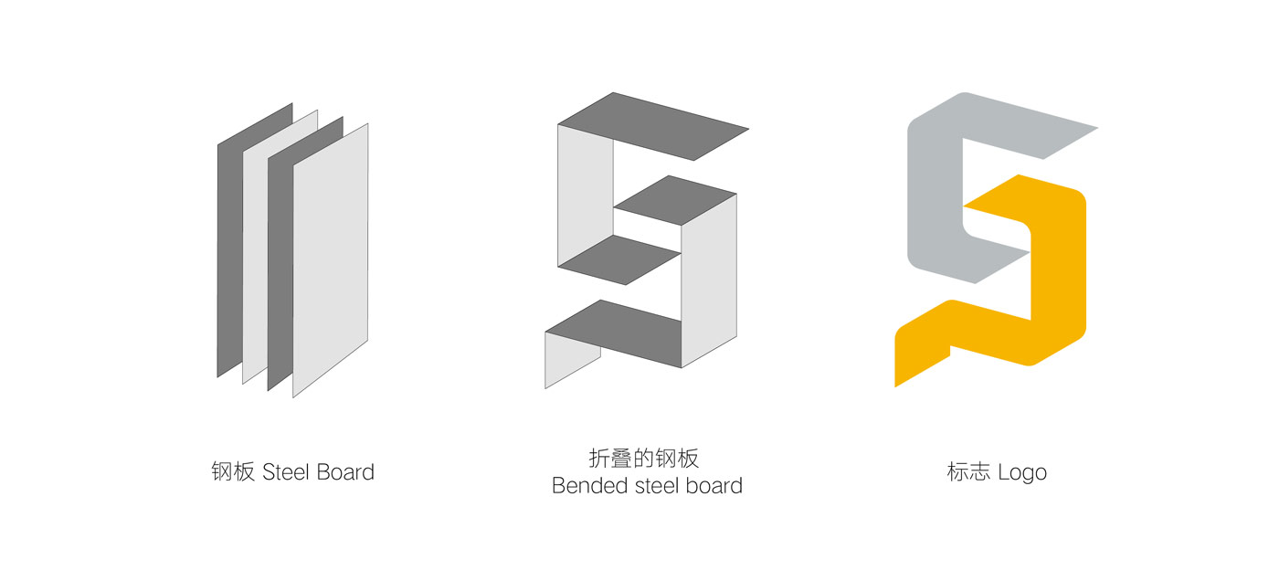
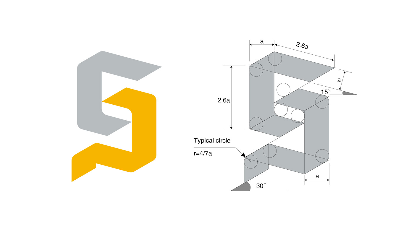
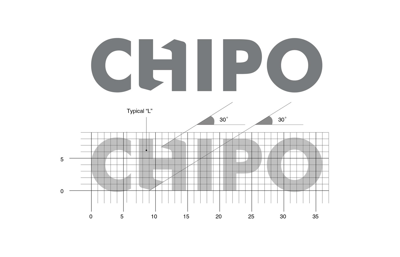
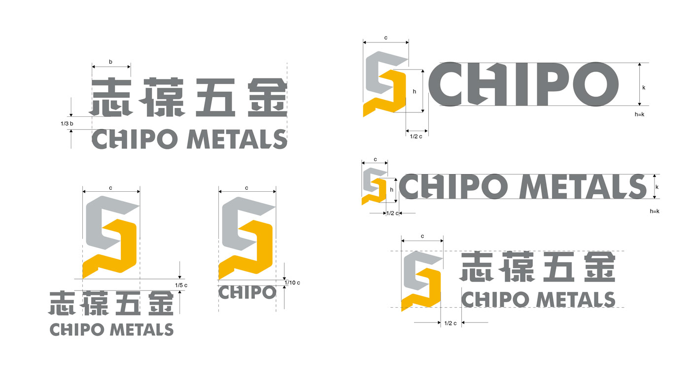
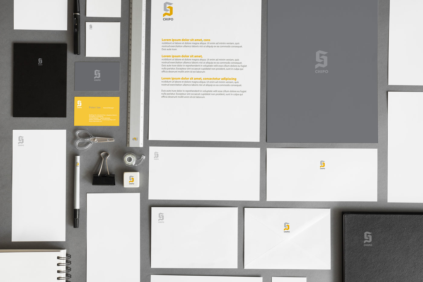
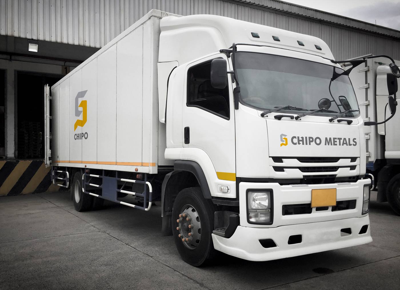
CHIPO METAL | 志葆五金
Chipo is a metalwork corporate. The idea of the logo comes from the image of bent metal plate and its initials. Since the owner believes in the theory of traditional Chinese philosophy: Wu Xing (Chinese five elements), the whole set of visual identity system adopts the color of earth (yellow) as the main color, in order to help the development of the corporate.
Chipo是一家金属制品厂,标志采用折弯金属板的形态,并结合其名称首字母设计而成。由于企业主笃信中国传统哲学的五行生克理论,因此整套视觉形象系统结合其行业属性,采用土的颜色(黄色)为主要色调,以期有助于企业的发展。
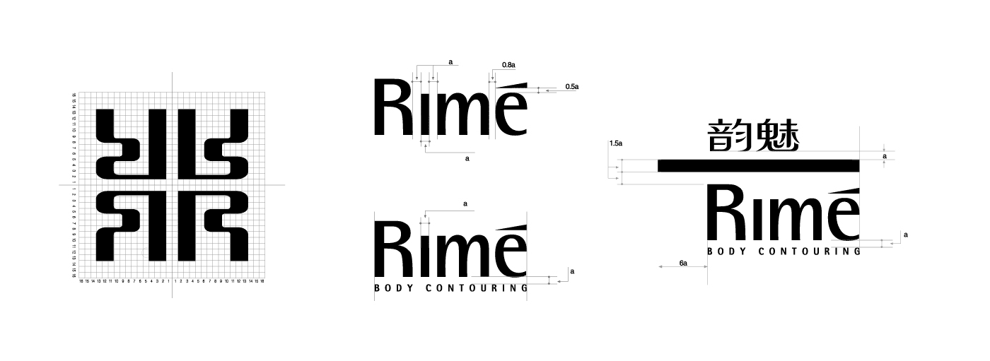
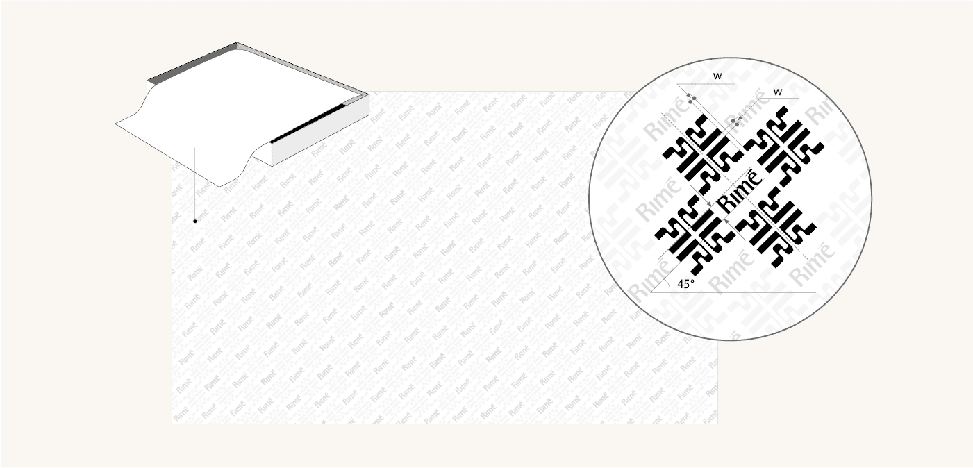
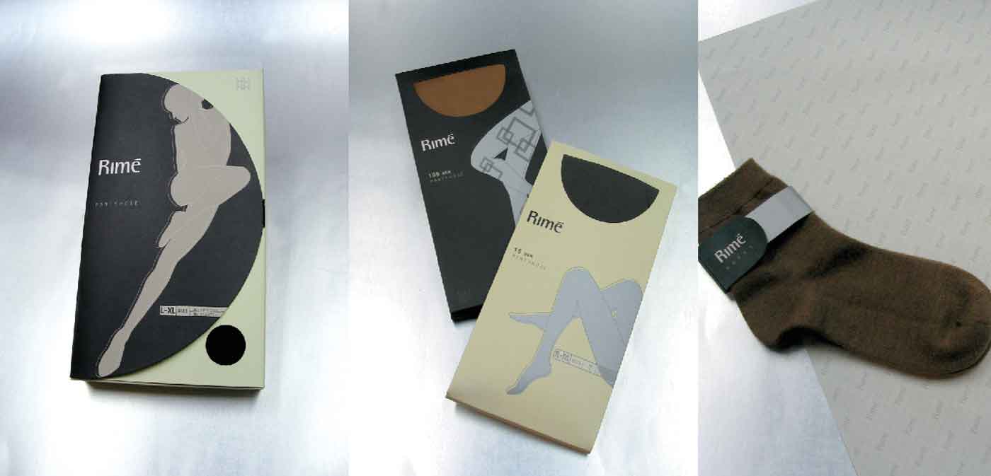
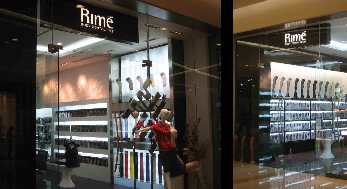
Rime
Rime is a textile brand under Grland. It is positioned as a high-end hosiery and underwear knitwear tailor-made for the quality consumption of Chinese women. Rime advocates a fashionable lifestyle, pursues classic luxury, and provides top-quality products and services.
Rime 是华润集团下属的纺织品牌,定位为中国品位女性的品质消费而量身笃造的高级袜品及内衣类针织品。Rime崇尚的是时尚的生活方式,追求的是经典的奢华,提供的是极品的产品和服务。